Various Logos
A selection of some of the logos I’ve designed over the past year (will be adding new ones as they are developed):
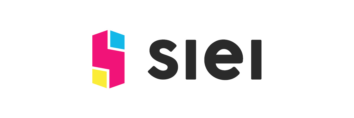
SIEI
A Spanish acronym for “IT Solutions and Print”, SIEI wanted a modern, eye-catching brand that reflected its IT and print roots in an eye-catching manner. Out of the proposals offered, the client liked this one the best – a PC Tower-stylised letter S with the three principal colour inks of print – Cyan, Magenta and Yellow.
MAYHEM GAMES
An up and coming developer of online games and apps, Mayhem wanted a professional logo that would help usher their products to a wider audience from mobile to steam. Big fans of the heavy metal theme, I worked on a typographic solution that delivers their character in a bold, sleek and professional brand.
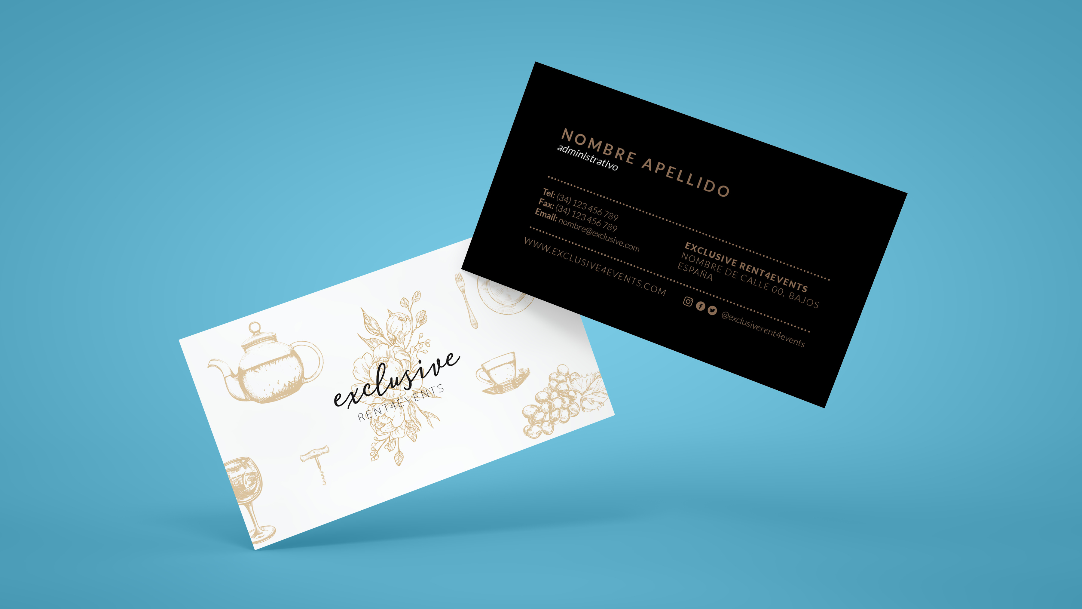
EXCLUSIVE
A company specialising in catering and event organisation; the concept was to use classic gold-toned vintage imagery to complement a brush-lettered logotype for a dynamic yet elegant branding.
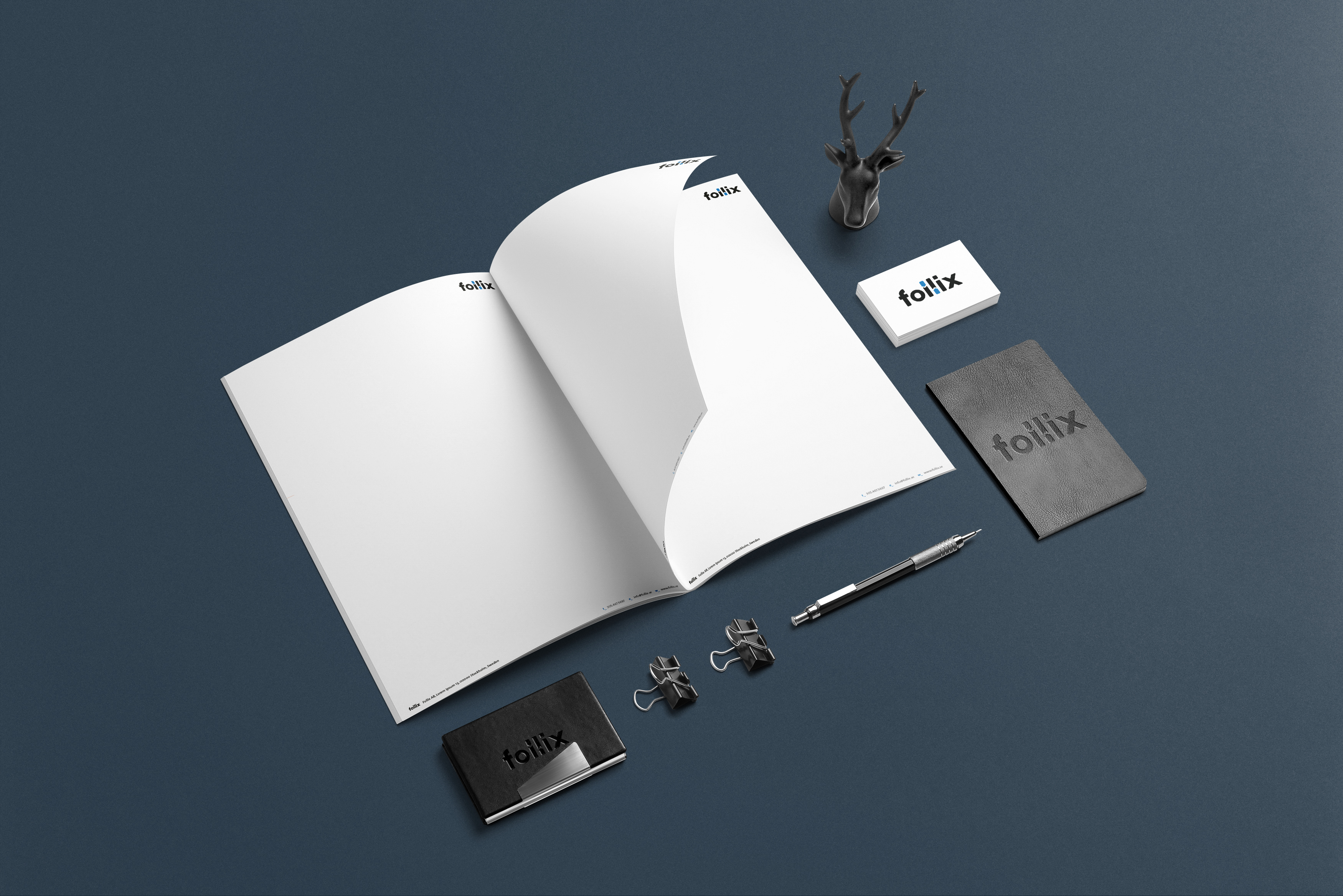
FOLLIX
A database and system development consultant, Follix needed a logo that best displayed his expertise in IT and reflected his brand as a sum of interconnecting pieces. I fancied the idea of a wordmark and the USB-stick reminiscent shapes used to compose the l-letters. The client loved the concept and the logo was set.
MANGASARIAN
Mangasarian Real Estate Services needed a corporate, professional logo that best represented all the services his business could offer to real estate holding clients. Having such a particular surname (and his first name also being Mike) I knew his name had to be front and centre and be memorable. The logotype, his very representative letter M, is meant to add a binding and structural support element.
IOBASE
Another data and tech consultation company, IOBase wanted something elegant and sleek, that represented their expertise in database programming and administration. I liked the concept of electronic circuits, as well as the I/O binary concepts of programming. The element between the I and the O is a subtle nod to that concept.
SOCIALMEDIA.BIZ
The client ran a simple news indexing site, based on referrals and social sharing. While not a demanding or complex concept, I do like the way this one turned out.
TOBLER’S WOODLAND
Specialising in hand-crafted woodworking and construction, Tobler’s wanted to find a way to incorporate their mascot in an appealing, modern manner. It was challenging to make the mascot illustration work with the logo, but this compromise worked out quite well and the client was very satisfied with the end result.
ATB DIGITAL
A digital marketing agency, ATB is meant to represent beginning to end solutions. Through use of negative space and progressive colour toning, a sense of progression is delivered in this design.
JA CONSTRUCTION
The client came with a very definite concept in mind, the use of his initials to shape the form of a house. This is an example of projects where clients with a very particular vision can make good use of a designer to make their vision shine.