CTCP
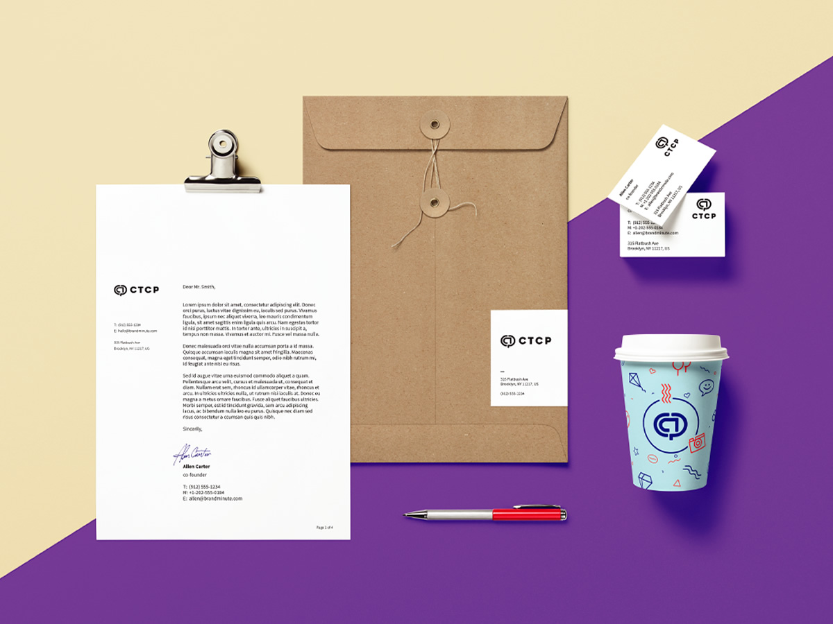
Chan’s Trading Company Pacific (CTCP) is a business specialising in providing quality materials for hotels and service providing businesses, ranging from tableware, textiles to merchandising in from stationery to towels. They approached me with a very dated, temporary logo they were using, that posed the problem of presenting themselves as a modern, professional company. They wanted a brand that could establish them as a modern, corporate business so they could better present themselves to larger clients, as well as seeking a logo they could easily stamp on their merchandise.
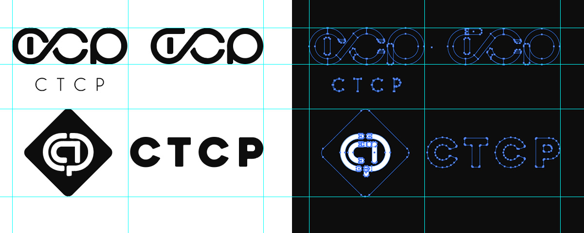
Among all logotype styles researched, it was clear they heavily favoured a corporate monogram for their new brand. Usually composed of two initials, monograms can be tricky to get just right, and in this case I was dealing with four letters!
Among the options presented, they were partial to two specific ones. The first, CTCP stylised in the shape of waves, alluding to the pacific ocean, as their home company is based in Hong Kong. While they loved the concept, ultimately the current logo was selected for its globe-like shape and international connotations. The ease with which the logo could be applied to their branding was also a big selling point.