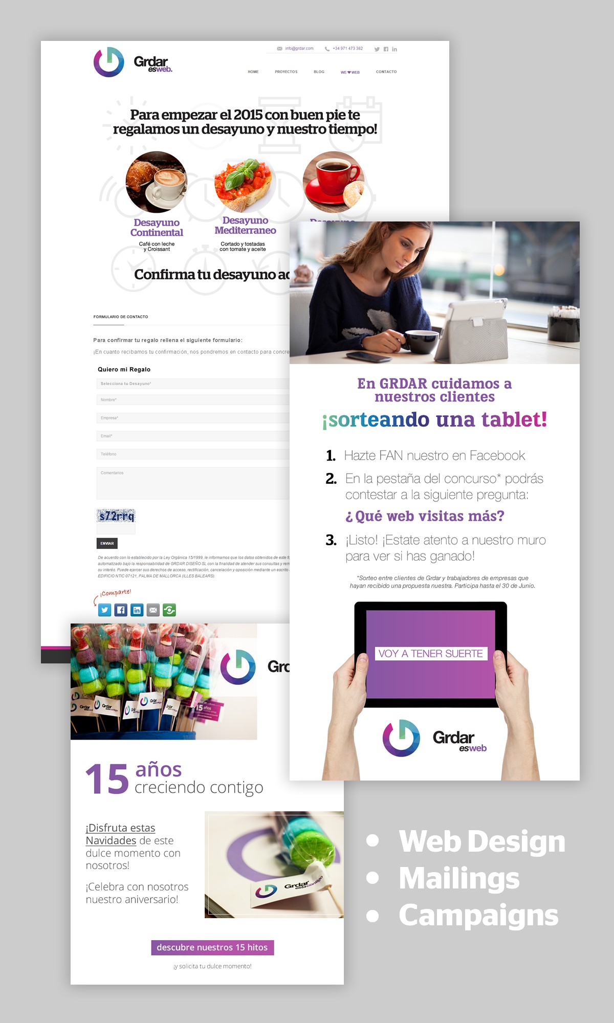
Grdar
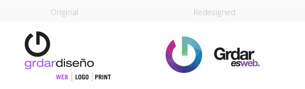
During my time as senior designer at Grdar (a web design and development studio) I was entrusted with the redesign of the company logo. Its always complicated to modernise an identity, and doubly so when the client works in the field of design themselves, but after several concepts and revisions, we opted for breaking down the logo to its basics and adding a dynamic element to make it adaptable for various applications. The company name “Grdar Design” was simplified to “Grdar”, and the baseline “Web / Logo / Print” was changed to “is web” (in Spanish, being a Spanish company of course).
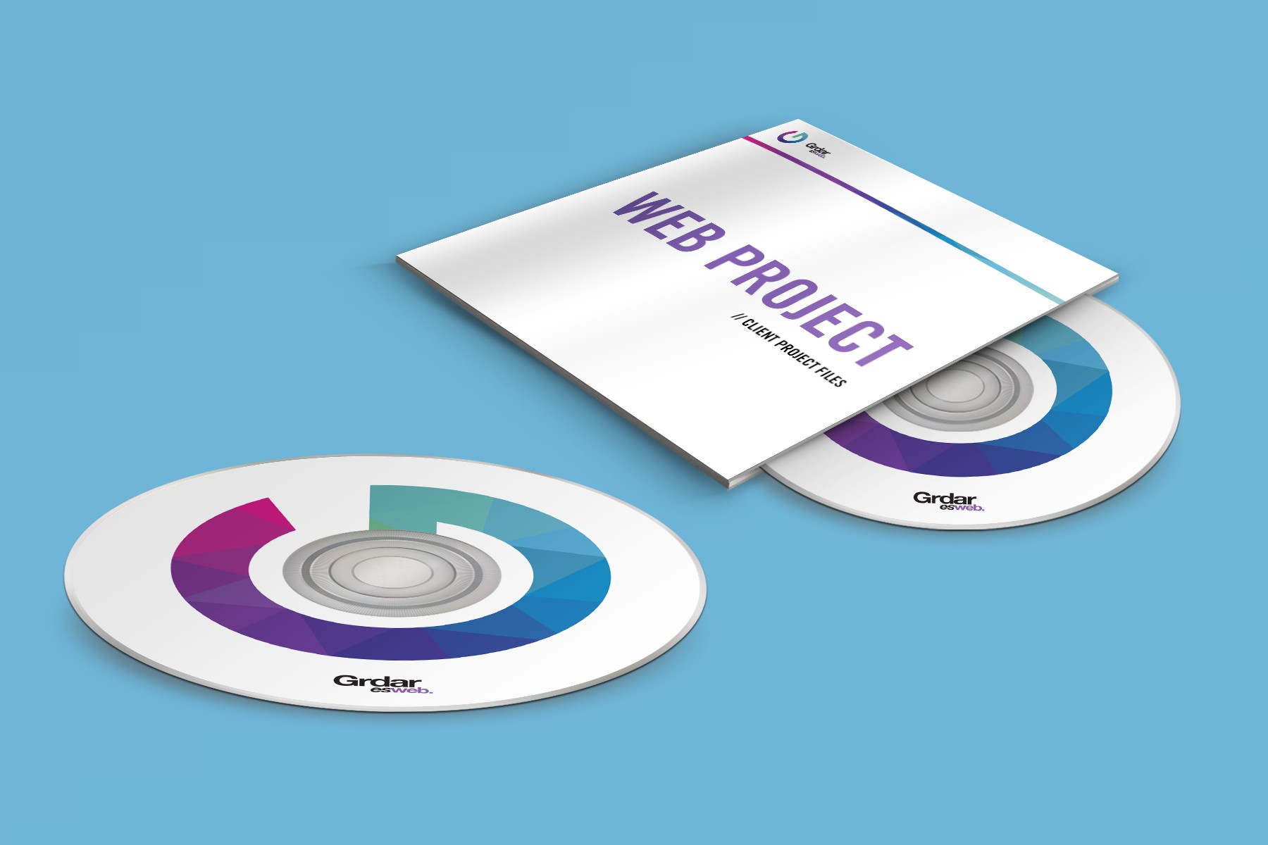
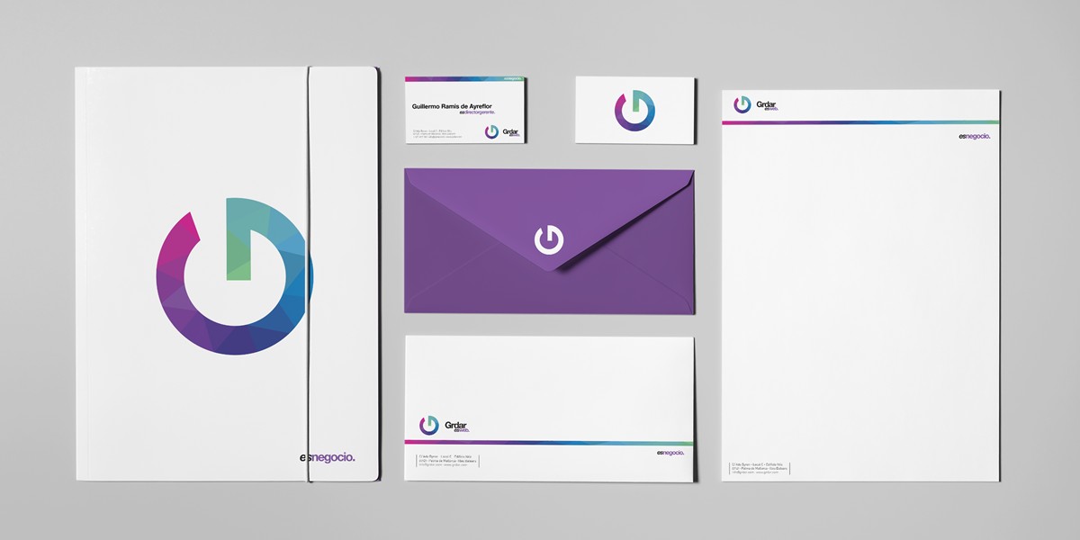
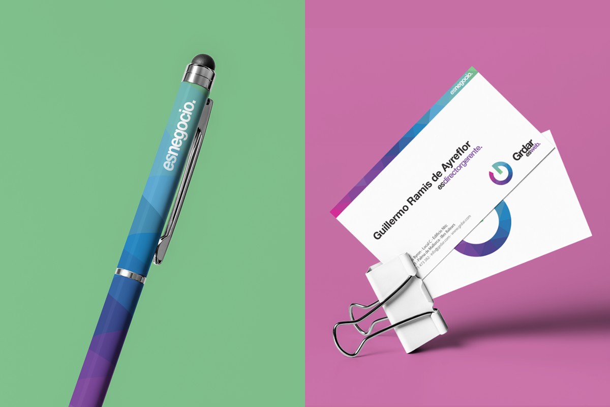
This baseline was to be the dynamic element of the new identity – interchangeable to whatever marketing piece the logo was applied to in order to reflect the adaptable and flexible nature of the design studio, which prides itself for being a service-first company. The logo itself was emboldened for more weight and presence, while its original violet color was expanded to a wider gamut of colours to further emphasise the wide array of services offered by the studio.